V1.0
simple-theme-framework.css
Description
Simple framework to give you (almost) complete accsess to all the color
settings in an easy variable based way.
I filtered out variables that aren't used on your profile pages and
hooked color codes to variables that previously weren't.
So no more searching through anilist's css to find a singular color code
nor researching what each variable affects.
One thing I didn't hook up are diverse small dropdown menus or a lot of
shadows.
(Just because there are a lot and their visual impact is minimal).
If you're still interested in them though, I added them in a comment at
the bottom of the file.
(Only darkmode ones though, but it should be easy enough to figure out
the non darkmode ones aswell.)
Features
- Ability to fully customize every color in light, dark and contrast mode.
Installation
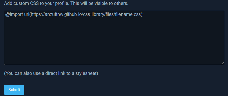
Quick Setup
Add
@import
          url("https://anzuftnw.github.io/files/simple-theme-framework.css");
into the custom css box inside your app settings and press submit.
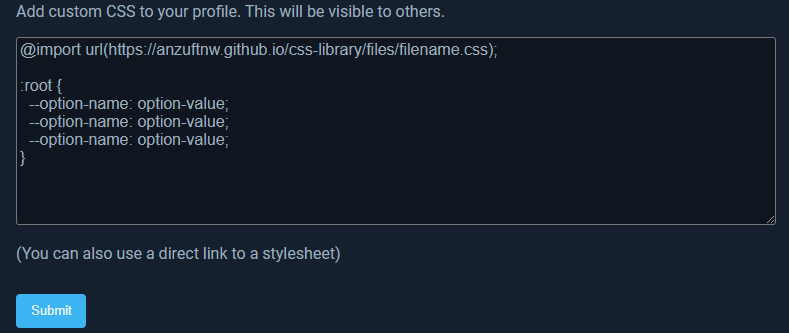
Then add the following code below it, change the options to your liking
and press submit:
(You're also able to only add the options you wanna change.)
/* settings */
/* global values */
:root {
  --color-nav-text-hover: 211, 213, 243; /* top navbar text on hover */
  --color-nav-transparent-background: 35, 38, 67, 0.5; /* top navbar background in transparent state */
  --color-nav-transparent-text: 229, 231, 234; /* top navbar text in transparent state */
  --color-background-blue-dark: 31, 35, 45; /* noscript background */
  --color-overlay: 31, 38, 49; /* favourites and activity history hover display, activity little arrow menu */
  --color-shadow: 49, 54, 68; /* social avatar hover */
  --color-shadow-blue: 103, 132, 187; /* popup/dropdown menu shadow */
  --color-text-bright: 237, 241, 245; /* username, noscript text */
  --color-blue: 61, 180, 242; /* links, link hover, statswrap amount numbers, activity history entrys */
  --color-blue-dim: 141, 178, 219; /* activity history entrys, heart and reply icons */
  --color-white: 255, 255, 255; /* to much stuff bust mostly text and icon related */
  --color-black: 0, 0, 0;
  --color-red: 232, 93, 117; /* heart liked, favourite entry remove icon background, submission rejected */
  --color-peach: 250, 122, 122; /* list entry red dot */
  --color-orange: 247, 154, 99;
  --color-yellow: 247, 191, 99; /* submission partially accepted */
  --color-green: 123, 213, 85; /* hoh link text, activity subscription bell active, list entry green dot */
  --color-footer-background: 17, 22, 29; /* footer background color */
  --color-footer-text: 160, 177, 197; /* footer text color */
  --theme-border: 70, 84, 107; /* theme preview border color */
  --theme-light-background: 237, 241, 245; /* light theme preview background color */
  --theme-light-text: 46, 60, 72; /* light theme preview text color */
  --theme-dark-background: 17, 22, 29; /* dark theme preview background color */
  --theme-dark-text: 160, 177, 197; /* dark theme preview text color */
  --theme-contrast-background: 255, 255, 255; /* contrast theme preview background color */
  --theme-contrast-text: 0, 0, 0; /* contrast theme preview text color */
  --genre-green: 104, 214, 57; /* genre overview color 1 */
  --genre-blue: 2, 169, 255; /* genre overview color 2 */
  --genre-purple: 146, 86, 243; /* genre overview color 3 */
  --genre-pink: 247, 121, 164; /* genre overview color 4 */
  --genre-red: 232, 93, 117; /* genre overview color 5 */
  --genre-orange: 247, 154, 99; /* genre overview color 6 */
}

/* light mode */
:root {
  --color-nav-background: 43, 45, 66; /* top navbar background */
  --color-nav-text: 188, 190, 220; /* top navbar text */
  --color-background: 237, 241, 245; /* background */
  --color-foreground: 250, 250, 250; /* foreground */
  --color-foreground-grey: 245, 246, 246; /* statswrap footer background */
  --color-foreground-grey-dark: 234, 236, 237; /* statswrap progress bar background, activity history empty field background */
  --color-text: 92, 114, 138; /* plain text, header, statswrap progressbar number indicators */
  --color-text-light: 122, 133, 143; /* genre and statswrap text, secondary navbar links */
  --color-text-lighter: 146, 153, 161; /* filter text, time stamp text and icons */
  --color-background-300: 221, 230, 238; /* statspage graph footer background */
  --color-background-200: 237, 241, 245; /* navdropdown footer background */
  --color-background-100: 251, 251, 251; /* navdropdown background */
  --color-gray-900: 81, 97, 112; /* navdropdown footer text and icon hover */
  --color-gray-800: 100, 115, 128; /* navdropdown primary text, text and icon hover */
  --color-gray-700: 116, 136, 153; /* navdropdown footer text and icons */
  --color-gray-600: 139, 160, 178; /* navdropdown secondary text and icons */
  --color-gray-300: 221, 230, 238; /* statspage curved graph fill color */
  --color-gray-100: 251, 251, 251; /* navdropdown little arrow thing */
}

/* dark mode */
.site-theme-dark {
  --color-nav-background: 21, 34, 50; /* top navbar background */
  --color-nav-text: 160, 177, 197; /* top navbar text */
  --color-background: 11, 22, 34; /* background */
  --color-foreground: 21, 31, 46; /* foreground */
  --color-foreground-grey: 15, 22, 31; /* statswrap footer background */
  --color-foreground-grey-dark: 6, 12, 19; /* statswrap progress bar background, activity history empty field background */
  --color-text: 159, 173, 189; /* plain text, header, statswrap progressbar number indicators */
  --color-text-light: 114, 138, 161; /* genre and statswrap text, secondary navbar links */
  --color-text-lighter: 133, 150, 165; /* filter text, time stamp text and icons */
  --color-shadow-blue: 0, 5, 15; /* popup/dropdown menu shadow */
  --color-background-300: 30, 42, 56; /* statspage graph footer background */
  --color-background-200: 11, 22, 34; /* navdropdown footer background */
  --color-background-100: 21, 31, 46; /* navdropdown background */
  --color-gray-900: 201, 215, 227; /* navdropdown footer text and icon hover */
  --color-gray-800: 173, 192, 210; /* navdropdown primary text, text and icon hover */
  --color-gray-700: 139, 160, 178; /* navdropdown footer text and icons */
  --color-gray-600: 116, 136, 153; /* navdropdown secondary text and icons */
  --color-gray-300: 30, 42, 56; /* statspage curved graph fill color */
  --color-gray-100: 21, 31, 46; /* navdropdown little arrow thing */
}

/* contrast mode */
.site-theme-contrast {
  --color-background: 229, 235, 241; /* background */
  --color-foreground: 251, 251, 251; /* foreground */
  --color-foreground-grey: 229, 233, 245; /* statswrap footer background */
  --color-foreground-grey-dark: 221, 225, 239; /* statswrap progress bar background, activity history empty field background */
  --color-text: 38, 52, 63; /* plain text, header, statswrap progressbar number indicators */
  --color-text-light: 64, 78, 92; /* genre and statswrap text, secondary navbar links */
  --color-text-lighter: 81, 97, 112; /* filter text, time stamp text and icons */
  --color-shadow: 37, 41, 51; /* social avatar hover */
  --color-blue: 18, 172, 253; /* links, link hover, statswrap amount numbers, activity history entrys */
  --color-blue-dim: 85, 144, 208; /* activity history entrys, heart and reply icons */
  --color-background-300: 173, 192, 210; /* statspage graph footer background */
  --color-background-200: 229, 235, 241; /* navdropdown footer background */
  --color-background-100: 251, 251, 251; /* navdropdown background */
  --color-gray-900: 38, 52, 63; /* navdropdown footer text and icon hover */
  --color-gray-800: 64, 78, 92; /* navdropdown primary text, text and icon hover */
  --color-gray-700: 64, 78, 92; /* navdropdown footer text and icons */
  --color-gray-600: 100, 115, 128; /* navdropdown secondary text and icons */
  --color-gray-300: 173, 192, 210; /* statspage curved graph fill color */
  --color-gray-100: 251, 251, 251; /* navdropdown little arrow thing */
}
Customize
If you want more freedom and disable or modify some of the things this
code snippet does you probably already know how to do so. Copy the
contents of
simple-theme-framework.css
into your custom css box or a seperat file and get started.
Changelog
2021/11/08- Version 1.0
- Initial release